Saffira Design System: Standardizing Our UI Architecture
From Bootstrap to PrimeNG
When building and scaling a mission-critical platform like Saffira, keeping the frontend maintainable and visually consistent across fast-moving features is an ongoing challenge. In the early versions of the application, our interface relied heavily on Bootstrap, combined with custom SCSS classes defined at the component level. To achieve specific layouts or force visual adjustments, we frequently resorted to deep style piercing (::ng-deep) and ad-hoc overrides scattered across individual views.
While that setup allowed the team to ship early screens quickly, it inevitably accumulated technical friction. Styling rules were fragile, visual behaviors varied between pages, and modifying a CSS rule in one place could unexpectedly disrupt another operational screen.
PrimeNG was actually our primary solution to move away from that legacy Bootstrap setup. Between 2024 and 2025, we undertook a broad modernization effort across Saffira, adopting modern Angular syntax and systematically replacing Bootstrap with PrimeNG components throughout the codebase. This transition gave us a much richer, modern component foundation—from tables and modal dialogs to dropdowns and form controls.
Standardizing with Reusable Wrappers
Even with PrimeNG integrated across the application, our UI architecture was not organized enough yet. Because components were consumed directly at the template level, developers still had to write local SCSS tweaks and repetitive markup to handle minor visual gaps, spacing adjustments, or brand alignments.
Every time a new view was created—whether an emergency dispatch screen, an asset table, or an operational modal—the developer had to re-assemble the PrimeNG template, wire up form controls, and re-apply local styling fixes. Over time, this led to subtle inconsistencies in how inputs, validation messages, and buttons behaved across different parts of the platform.
By that point, our product design had matured and become consolidated. We had a clear, defined visual identity for our core elements: how form inputs should highlight, how validation feedback should display, how buttons should respond, and how dialogs should be structured.
That was the catalyst for the design system initiative. Rather than continuing to make direct library calls and scatter SCSS patches across screens, I initiated the process of building reusable wrapper components around PrimeNG templates.
These wrappers encapsulate the template markup, design tokens, and common interaction behaviors. For form fields, for example, the wrapper manages floating labels, state indicators, and validation feedback under the hood. Developers simply drop in a unified component, eliminating repetitive template boilerplate and guaranteeing visual and functional consistency across every view.
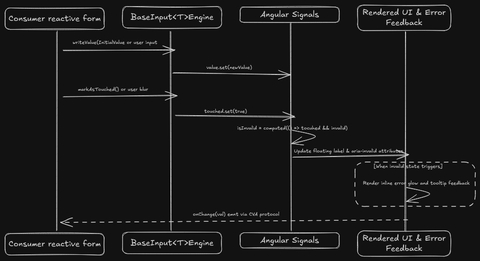
Figure 1.1: Component wrapper flow: encapsulating template structure, reactive form state, and visual validation into unified building blocks.
A Shared Design System Library
The real power of this architecture became apparent as our product ecosystem grew. When we began planning and developing other applications—such as Saffira-Admin and new internal tools—the initial instinct might have been to copy-paste our existing templates and styling rules into new repositories. Doing so would have quickly resulted in divergent, fragmented user experiences.
Because our PrimeNG wrappers and design patterns were already consolidated, we took the next step: extracting our updated component structure into an independent library, published to our private registry as @aton-engenharia/saffira-design-system.
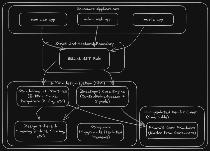
Figure 2.1: Saffira Design System multi-tier decoupled architecture across consumer applications.
Instead of re-implementing UI elements for each new project, our teams can now simply install the design system library. What we built, refined, and tested once is reused directly across multiple applications. With an automated CI/CD release pipeline, any visual enhancement or component refinement made in the library distributes across all consuming apps seamlessly.
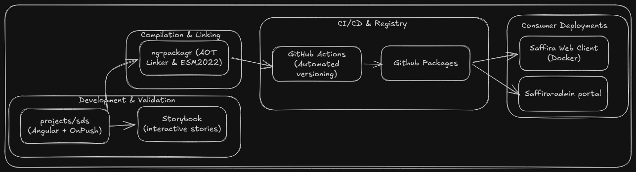
Figure 2.2: Centralized packaging and CI/CD distribution pipeline, delivering versioned design system releases to our ecosystem of applications.
Evolving our frontend from ad-hoc styling patches into a shared design system library reinforced several fundamental engineering takeaways:
- Treating UI as an Internal Product: A design system is much more than a collection of styling rules—it is an internal product that requires clear contracts, consistent defaults, and a strong developer experience. Treating it as a first-class package forces thoughtful decisions about reusability and boundaries.
- Encapsulating Vendor Dependencies: Wrapping third-party component templates shields consumer applications from underlying library quirks. It keeps our codebase clean, eliminates fragile component-level CSS overrides, and makes future library upgrades manageable.
- Compounding Velocity Across Apps: Building once and reusing everywhere transformed frontend delivery across Aton. Instead of spending hours adjusting templates and fixing minor styling bugs, engineers can assemble complete, polished interfaces in minutes—allowing our team to stay focused on our core mission of building real-time disaster management and environmental protection tools.